Tuesday, 6 January 2015

Magazine Production: Text

The text is an important feature.
I added text to the bottom to add more detail to the page. I didn't like the white blank space so I decided to put more text there.


Monday, 5 January 2015

Magazine Production: Adding more details.


After the small details I added before, I then moved onto adding the photos to move my page on further.
I added each photo like this because I like the layout of the two landscape photos and then a portrait one. On top of each photo I decided to put small story hooks in bold white writing so it looks like it is transparent against the background.
 
 
For the bottom section of the page, I want to have more story hooks for the magazine. I adapted this idea from my style model.


Monday, 15 December 2014

Magazine Production: Building The B-Side

This is the beginning of my second contents page and what I done to create it.

Thursday, 11 December 2014

Magazine Production: Changing the Masthead on Contents Page 1

I thought my magazine contents page looked better if I put some original title work into it. I decided to change the title from "The A-side" to "The A-team"
This is the font I chose from Dafont called Bebas Neue.
I cut away the background using the Magic Wand Tool, then posted it into my original page & changed the dash colour to keep with my house style and be the same swatch of red as my logo.


Wednesday, 10 December 2014

Magazine Production: Contents Page 2 Images

For this content's page, I decided to use many different images to fit along the conventions of a music magazine.


Magazine Production: Contents Page Text

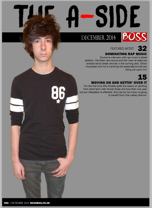
The final steps in creating my magazine is adding relevant story hooks to the contents page. This text is important because it is seen on all contents pages and will direct the readers where to look towards.

I started adding text like  "Featured Artist" to let the readers know that this story is about the cover artist. I also decided to have the story title in black bold font called Franklin Gothic Heavy. I Chose to do it this way so they stand out more and appeal to the audience. The story brief underneath is in a small font to ensure that the title stands out.
 
 
After adding all the text, I realised that the "featured artist" didn't stand out very well. So I decided to put a small red box underneath it.